學習重點
HTML 架構
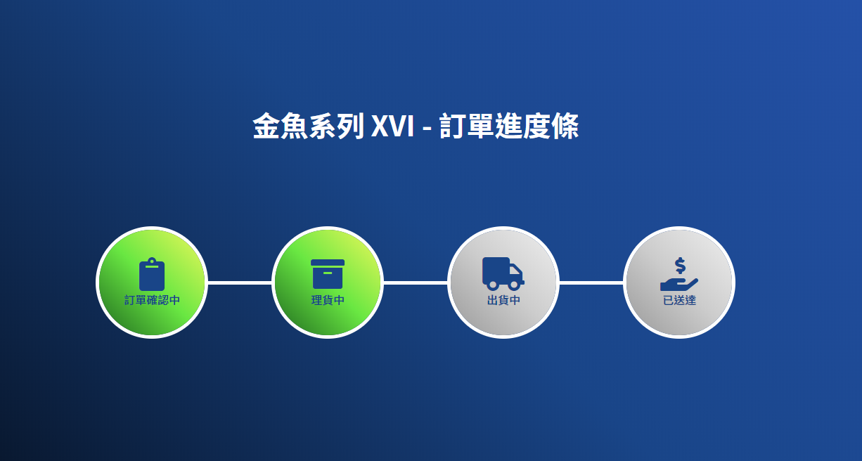
- 使用清單列表改成橫向排列,就可以達到這樣的排版。
- 因為有順序,所以使用
ol。
1
2
3
4
5
6
7
8
9
10
11
12
13
14
15
16
17
18
| <ol class="process">
<li>
<i class="fas fa-clipboard fa-3x"></i>
<p>訂單確認中</p>
</li>
<li class="active">
<i class="fas fa-archive fa-3x"></i>
<p>理貨中</p>
</li>
<li>
<i class="fas fa-truck fa-3x"></i>
<p>出貨中</p>
</li>
<li>
<i class="fas fa-hand-holding-usd fa-3x"></i>
<p>已送達</p>
</li>
</ol>
|
CSS 樣式
- 為了讓整個畫面的元素直向排列,所以在 body 先設定好。
1
2
3
4
5
| body {
box-sizing: border-box;
font-family: "Noto Sans TC", sans-serif;
display: flex;
align-items: center;}
|
- 使 li 變橫向排列,並使元素垂直對齊與置中,主次軸的觀念很重要!
- 讓圖片與文字元素置。
- 使第二個元素靠左推擠 100px 的空間。
- 因為已經選取第二個元素,故使用偽元素在前方做線條。
- 這邊使用絕對定位與 margin:auto 的對齊方式,說明可見學習重點。
- 為了避免線條跑到元素上方,使用 z-index 調整位置。
1
2
3
4
5
6
7
8
9
10
11
12
13
14
15
16
17
18
19
20
21
22
23
24
25
26
| li {
display: flex;
flex-direction: column;
justify-content: center;
text-align: center;
width: 150px;
height: 150px;
border-radius: 100px;
position: relative;
background-image: linear-gradient(45deg, #1e681e, #69e742, #eef85a);
box-shadow: 0 0 0 5px #fff;
& + li {
margin-left: 100px;
&::before {
content: "";
position: absolute;
width: 100px;
height: 5px;
background-color: #fff;
top: 0;
bottom: 0;
left: -100px;
margin: auto;
z-index: -1;
}
}
|
最後加上進度效果。
1
2
3
4
5
6
7
| &.active ~ li {
background-image: linear-gradient(45deg, #999, #ccc, #eee);
}
.fas,
p {
color: #194588;
}
|
CodePen https://codepen.io/hnzxewqw/full/xxZoarj
參考資料